
One of the diagrams you will have come across is the cumulative frequency diagram.
When you are dealing with cumulative frequency, you are expected to be able to find the median and interquartile range.
You need to think about why you might need to find these - why do we find averages and measures of spread? The answer is that we find these so that we can compare distributions.
To make these comparisons from cumulative frequency diagrams, we use box plots (also sometimes called box and whisker diagrams).
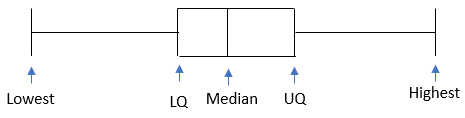
What is a box plot?
A box plot is a diagram that allows us to make a visual comparison of the median, quartiles and min/max values for a distribution.
Where do we get the values from?
There are two ways you can get the information: the first is that you could be told the numbers and asked to draw a plot; the second way would be for you to get a cumulative frequency graph and be asked to draw a box plot.
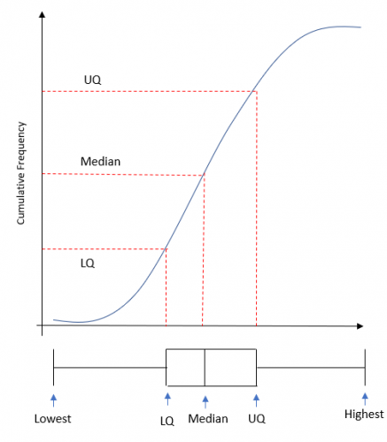
If any of the information cannot be read from the graph (this is sometimes the case for the highest/lowest), you will be told it in the question.
Let's have a go at some questions now.

Teacher explanation