Loading please wait

The smart way to improve grades

Comprehensive & curriculum aligned

Try an activity or get started for free

Practise Interpreting Line Graphs

In this worksheet, students will answer questions about data from a line graph.

'Practise Interpreting Line Graphs' worksheet

Key stage:  KS 2

Year:  Year 6 Maths worksheets

Curriculum topic:   Statistics

Curriculum subtopic:   Use Charts and Graphs

Difficulty level:  

Worksheet Overview

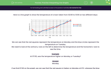
Here is a line graph to show the temperature of a town taken from 02:00 to 13:00 on two different days:


line graph


We can see that the red squares represent the temperature on Monday and the blue circles represent the temperature on Tuesday.

We need to look at the vertical y-axis on the left to determine the temperature and the horizontal x-axis to see the time.


Example

At 07:00, was the temperature higher on Monday or Tuesday?


Answer

Monday


If we find 07:00 on the graph, we can see that the red square is higher on Monday at 0°C, whereas the blue circle is lower at -1°C.


family playing in the rain


Let's get started and have a go at answering some more questions about this line graph.

What is EdPlace?

We're your National Curriculum aligned online education content provider helping each child succeed in English, maths and science from year 1 to GCSE. With an EdPlace account you’ll be able to track and measure progress, helping each child achieve their best. We build confidence and attainment by personalising each child’s learning at a level that suits them.

Get started
laptop

Try an activity or get started for free

  • National Tutoring Awards 2023 Shortlisted / Parents
    National Tutoring Awards 2023 Shortlisted
  • Private-Tutoring-WINNER-EducationInvestor-Awards / Parents
    Winner - Private Tutoring
  • Bett Awards Finalist / Parents
    Finalist
  • Winner - Best for Home Learning / Parents
    Winner - Best for Home Learning / Parents