


What do you remember about histograms?

A histogram is a type of chart representing the distribution of data with a series of bars.
That sounds an awful lot like a bar chart, doesn't it?!
However, there are a few key differences between a bar chart and a histogram:
Histograms are used for continuous data (data that can take on any value within a certain range e.g. time, height) while bar charts are used for discrete data (can only take certain values e.g. shoe size, number of siblings)
There are gaps between the bars in a bar chart (no gaps in histograms since the data is continuous)
The bars in a bar chart have to be of equal width, whereas the bars in histograms often have unequal widths (depending on the data)
We always have frequency density on the y-axis in a histogram (whereas the y-axis could be a number of things in a bar chart: frequency, percentages etc.)
Let's have a look at an example:
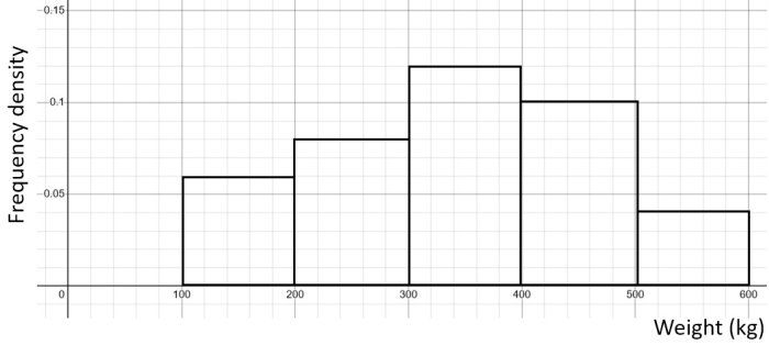
The weights of small cars were recorded:
| Weight (kg) | Frequency |
|---|---|
| 100 ≤ w < 200 | 6 |
| 200 ≤ w < 300 | 8 |
| 300 ≤ w < 400 | 12 |
| 400 ≤ w < 500 | 10 |
| 500 ≤ w < 600 | 4 |
We can see that each interval has the same width of 100, which means that the bars in the histogram will be all of the same width!
To find our frequency densities to construct the histogram, we just divide the frequencies by the width of the interval (100):
| Weight (kg) | Frequency | Frequency density |
|---|---|---|
| 100 ≤ w < 200 | 6 | 6 ÷ 100 = 0.06 |
| 200 ≤ w < 300 | 8 | 8 ÷ 100 = 0.08 |
| 300 ≤ w < 400 | 12 | 12 ÷ 100 = 0.12 |
| 400 ≤ w < 500 | 10 | 10 ÷ 100 = 0.1 |
| 500 ≤ w < 600 | 4 | 4 ÷ 100 = 0.04 |
Plotting the weight on the x-axis and the frequency density on the y-axis, we get our histogram:
If, on the other hand, we have intervals of unequal widths, we just need to be careful that we divide by the different numbers to get the frequency densities.
For example, the following frequency table shows the ages of participants in a study:
| Age (years) | Frequency |
|---|---|
| 20 ≤ Age < 25 | 12 |
| 25 ≤ Age < 30 | 18 |
| 30 ≤ Age < 40 | 25 |
| 40 ≤ Age < 55 | 15 |
We have the widths:
25 - 20 = 5 for the 20 ≤ Age < 25 class
30 - 25 = 5 for the 25 ≤ Age < 30 class
40 - 30 = 10 for the 30 ≤ Age < 40 class
55 - 40 = 15 for the 40 ≤ Age < 55 class
So we will be dividing the frequencies by different numbers to get our frequency densities:
| Age (years) | Frequency | Frequency density |
|---|---|---|
| 20 ≤ Age < 25 | 12 | 12 ÷ 5 = 2.4 |
| 25 ≤ Age < 30 | 18 | 18 ÷ 5 = 3.6 |
| 30 ≤ Age < 40 | 25 | 25 ÷ 10 = 2.5 |
| 40 ≤ Age < 55 | 15 | 15 ÷ 15 = 1 |
We then get the following histogram:
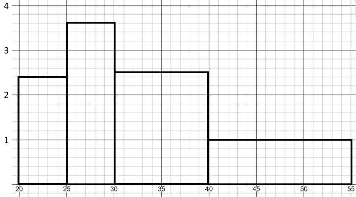
Can you see that the bars have different widths because each class had a different interval width?!
Let's have a go at some questions!


