
EdPlace's Year 8 home learning maths lesson: Data
Looking for short lessons to keep your child engaged and learning? Our experienced team of teachers have created English, maths and science lessons for the home, so your child can learn no matter where they are. And, as all activities are self-marked, you really can encourage your child to be an independent learner.
Get them started on the lesson below and then jump into our teacher-created activities to practice what they've learnt. We've recommended five to ensure they feel secure in their knowledge - 5-a-day helps keeps the learning loss at bay (or so we think!).
Are they keen to start practising straight away? Head to the bottom of the page to find the activities.
Now...onto the lesson!
What's It All About?
A quick glance through newspapers or websites and you will see quite a few graphs and charts like those below used to help explain the data and trends within it.
But can your child check that they are being interpreted correctly and draw their own conclusions? Can you explain why scales are important and how to interpret the angles in a pie chart?
We're confident that if you follow this step-by-step approach together, your child will be able to:
1) Understand how to interpret a bar chart or a pie chart.
2) Apply this understanding to answer questions on the data
3) Explain their own conclusions from the data, if they've really cracked it!
Step 1 - Key Terminology
Before we jump into solving equations it’s important to check that your child understands what the key terminology means.
A bar chart is a chart that has a bar showing the measurement or frequency for each class in the data. The axes (scales along the bottom and side of the graph) should have labels and scales if appropriate.
A pie chart is a circular chart which shows how the categories in a set of data “share out” the total.
Step 2 - Bar Charts and Pie Charts
Here is a bar chart showing the numbers of pets owned by the pupils in a class.
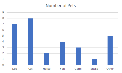
If we look at the column labelled dog, we can see that its height of 7. This means that there are 7 dogs owned by pupils in the class.
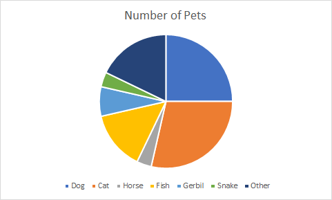
In this pie chart each type of pet has a share of the circle. Note that without further information, we can only compare these shares- we cannot tell how many dogs there are in the class, we can only say that a quarter of the pets in the class are dogs.
Step 3 - Comparing Two Frequencies
Moving on to answering questions that are likely to be asked in a test or exam, we may need to read compare two frequencies, or add all the frequencies to produce a total. There may even be side by side bar chart where 2 measurements can be compared for a category.
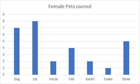
A) Which animal has the greatest frequency?
B) What is the total number of female pets owned by the class?
C) Which pet is the least popular in the class?
Here is a side by side bar chart that compares the number of male and female pets owned.
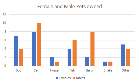
D) What is the difference between the numbers of male cats and dogs?
E) What is the difference between the numbers of male and female pets owned?
Now let’s look at comparing female and male pets in pie charts.
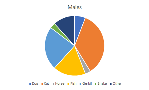
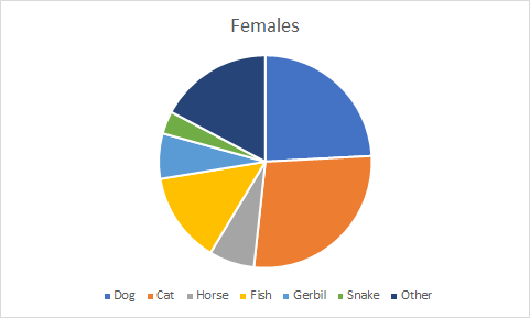
Without extra information we cannot tell exact numbers of pets from these charts, but we can see that cats make up the largest share of the male pets, as do female cats. The next most popular male pet is the gerbil, whereas the next most popular female pet is the dog.
F) Are there more female dogs than male dogs?
Step 4 - Putting it into Practice
Now we can practice solving answering questions on bar charts and pie charts.
1. How many snakes are owned in total?
2. Is the total of cats and dogs in the class bigger or smaller than the totals of all other pets?
3. Which animal has the greatest difference in males and females?
4. Which animal has the smallest share in both pie charts?
5. Which male animal has approximately a quarter share?
6. Which other comparisons can you make about male and female pets?
Step 5 - Give it a go...
Why not test your child's understanding and see if they can tackle these activities?
All activities are created by teachers and automatically marked. Plus, with an EdPlace subscription, we can automatically progress your child at a level that's right for them. Sending you progress reports along the way so you can track and measure progress, together - brilliant!
Activity 1 - Understand bar charts
Activity 2 - Interpret Pie Charts
Activity 3 - Practice reading shares in a single pie chart.
Activity 4 - Ratio and Proportion: Reading a Pie Chart (2)
Activity 5 - How To Draw Pie Charts
Step 3 Answers:
A) The Cat column has the tallest frequency of 8 and therefore the most frequently owned pet in this chart is a cat.
B) Adding the frequencies of all columns gives a total of 29 female pets owned by the class.
C) Although the snake has a frequency of 1, it is not possible to tell which pets are included in the “other” bar. We therefore cannot be sure of the correct answer to this question.
D) There are 10 male cats and 4 male dogs (looking at the orange bars) and therefore the difference is 6.
E) Adding the totals from the female bars and the male bars gives totals of 34 and 29, so the difference is 5.
F) It is not possible to tell, as pie charts only show share of the whole.
Step 4 Answers:
1. There is one female and one male, so a total of 2.
2. There are 29 cats and dogs, but 34 animals that are not cats and dogs. So, there are more animals that are not cats and dogs.
3. There are 8 male gerbils and 2 female gerbils, so the greatest difference is 6.
4. Snake has the smallest share in both pie charts.
5. The gerbil has approximately a quarter share in the male pie chart, its angle is very close to 90 degrees.
6. There are visible differences between male and female cat shares, there is very little visible difference between the shares of the male and female horses.....
Keep going! Looking for more activities, different subjects or year groups?
Click the button below to view the EdPlace English, maths, science and 11+ activity library