Loading please wait

The smart way to improve grades

Comprehensive & curriculum aligned

Try an activity or get started for free

Compare Three Sets of Data in Bar Graphs

In this worksheet, students will answer comparison questions about data from a bar chart.

'Compare Three Sets of Data in Bar Graphs' worksheet

Key stage:  KS 2

Year:  Year 5 Maths worksheets

Curriculum topic:   Statistics

Curriculum subtopic:   Complete, Read and Interpret Tables

Difficulty level:  

Worksheet Overview

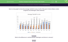
Here is a bar graph to show the average rainfall for every month of the year in Rome (Italy), London (England) and Wellington (New Zealand):


bar chart to show average rainfalls


Example

What is the difference in rainfall between Wellington and Rome in January?


Answer

27 mm


We can see that the blue bar for Rome is 49 mm and the grey bar for Wellington is 76 mm in January.


76 mm - 49 mm = 27 mm


boy playing in the rain


Let's get started and have a go at answering some more comparison questions about this bar chart.

What is EdPlace?

We're your National Curriculum aligned online education content provider helping each child succeed in English, maths and science from year 1 to GCSE. With an EdPlace account you’ll be able to track and measure progress, helping each child achieve their best. We build confidence and attainment by personalising each child’s learning at a level that suits them.

Get started
laptop

Try an activity or get started for free

  • National Tutoring Awards 2023 Shortlisted / Parents
    National Tutoring Awards 2023 Shortlisted
  • Private-Tutoring-WINNER-EducationInvestor-Awards / Parents
    Winner - Private Tutoring
  • Bett Awards Finalist / Parents
    Finalist
  • Winner - Best for Home Learning / Parents
    Winner - Best for Home Learning / Parents