


Would you expect a taller person to have a higher or lower weight than a shorter person?

Here is a scatter graph where the heights of 10 people were plotted against their weights of those people:
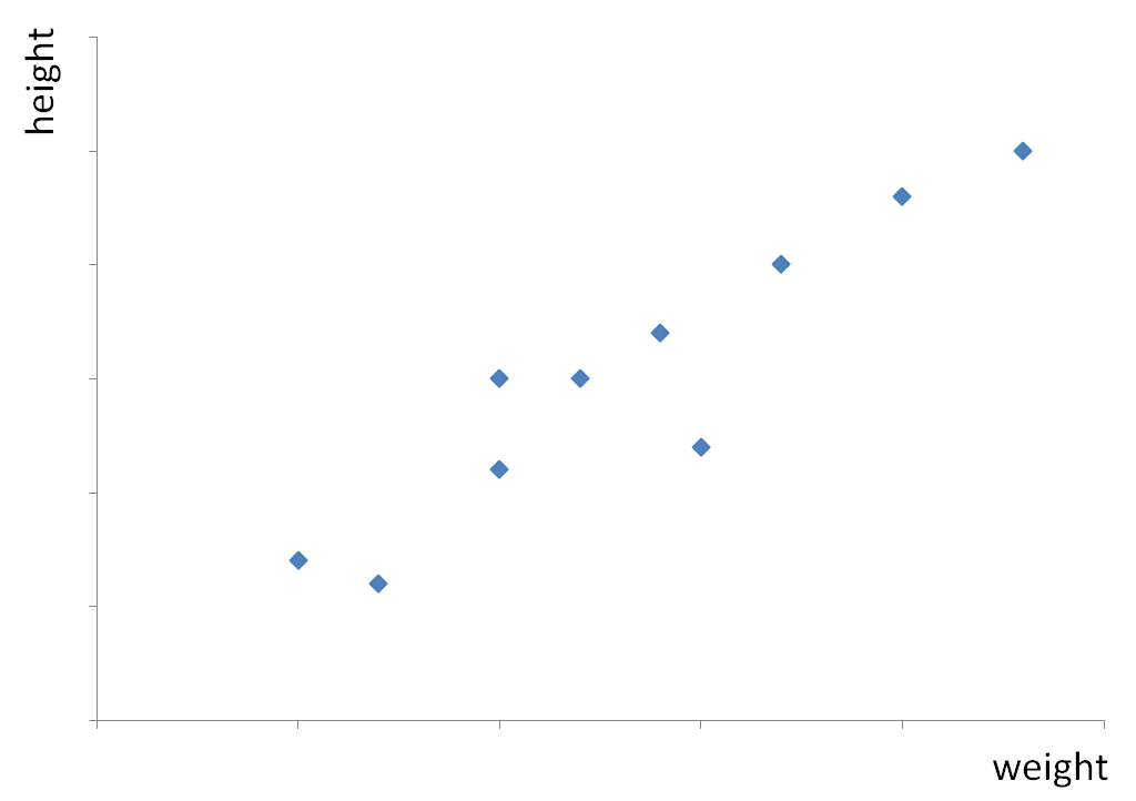
The scatter graph shows us that the higher weight a person has, the taller he/she is.
There is a definite connection between weight and height.
When one variable increases as the other increases ('the higher x is, the higher y is'), we have a positive correlation.
The following scatter graphs show negative correlation (the points are going 'down') and no correlation (the points are 'random' - there is no pattern).
.png)
.png)
So if weight and height are positively correlated, does that mean higher height always means higher weight?
.jpg)
Of course not!
Higher and lower weight is caused by many things such as lifestyle factors and one's health conditions.
Correlation just tells us there is a link between those two variables, not that one causes the other!
In other words, correlation is not causation.
For example, in a city, there's a strong correlation between the number of cinemas and the crime rate.
Does this mean that cinemas cause crime?
No! It's more likely that both the number of cinemas and the crime rate are influenced by factors such as population density or economic conditions rather than cinemas directly causing crime.

But just because correlation is not causation doesn't mean we can't use correlation to predict what value one variable could be, based on the other.
Let's look at one more example with this rent vs distance from London scatter graph:
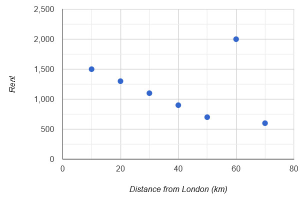
How could we find what rent would be 35 km away from London based on the correlation?
To make any predictions, we need to draw the line of best fit:
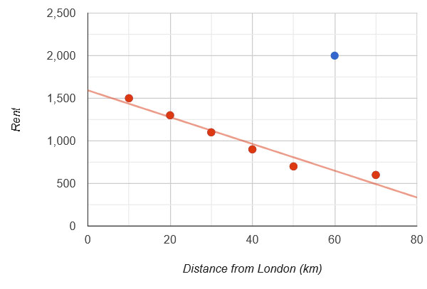
We can see that we omitted the blue point - the outlier (60, 2000) where we have a rent of £2,000 at 60 km away from London.
(Maybe there is a particularly beautiful or popular town 60 km from London and that's why we have an outlier there!)
.jpg)
We always omit outliers when we draw the line of best fit as they are not representative of the relationship at large.
With a line of best fit, we can use the scatter graph to see what rent would be 35 km away from London based on the trend:
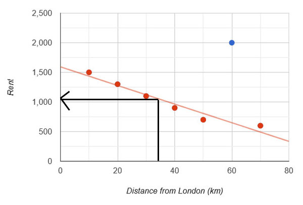
So we can see that the cheapest rent we can expect is just above £1,000!
Note that we always want to draw lines with arrows like above when we are reading off graphs!
Ready to have a go at some questions?


