


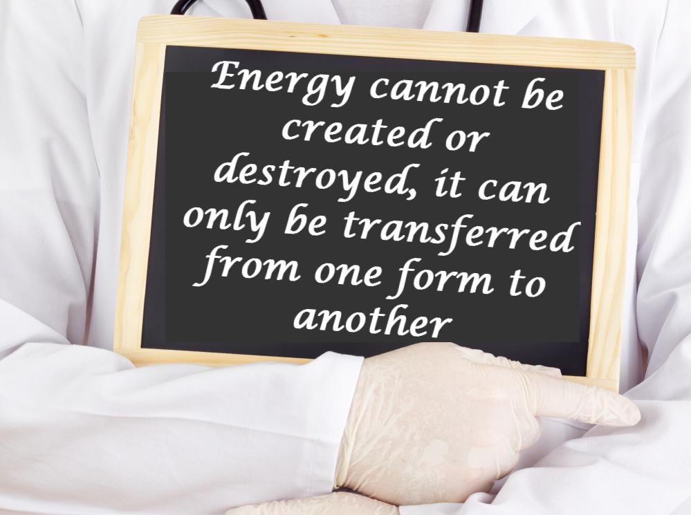
You should be familiar with the rule that energy cannot be created or destroyed. This is the principle of conservation of energy and it tells us that the total amount of energy that goes into a process must equal the total amount that comes out.
One way of representing energy transfers is a Sankey diagram, which is drawn like this:
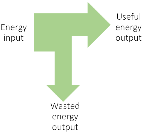
As you can see, the total energy is always drawn on the left-hand side. Arrows then branch away, with the useful energy pointing forwards and the wasted energy pointing downwards.
The thicker the arrow, the greater the amount of energy. As we know from the principle of conservation of energy, the total amount of energy on the left-hand side must equal the total on the right-hand side.
So, Sankey diagrams are an effective way of showing the energy transfers that occur in a system, and are also a way of visually representing how useful an energy transfer is. Processes that transfer a high percentage of the input into useful energy are more efficient.
Here is an example question:

A light bulb has an input of 100 J of electrical energy. It transfers this into 40 J of light and 60 J of heat. Draw a Sankey diagram for this bulb.
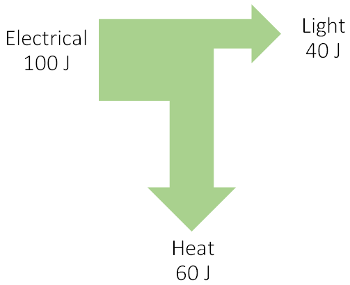
The Sankey diagram has 100 J of electrical energy as its input, drawn on the left. The useful energy is light, so it points forwards, and the wasted energy is heat, so it points downwards.
Notice the arrow for heat is thicker than the arrow for light, as it represents a greater amount of energy, and of course, the total amount of energy on the left (100 J) equals the total amount of energy on the right (40 J + 60 J). This particular bulb is wasting more energy than it is transferring usefully, so this is not a very efficient bulb.
Now that you have seen how these diagrams work, have a go at answering some questions on this topic.