
In this activity, we will be learning to read and understand information from a bar chart.
Bar charts can be used to show numbers and information. They are often used to record time and distance.
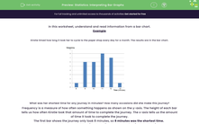
Kirstie timed how long it took her to cycle to the paper shop every day for a month. The results are in the bar chart.
|
|
The height of each bar on the y-axis tells us how often Kirstie took that amount of time to complete the journey.
The x-axis tells us the amount of time it took to complete the journey.
Let's try some example questions using the bar chart.
Example 1
What was her shortest time for any journey in minutes?
Answer
The first bar shows the journey only took 8 minutes, so 8 minutes was the shortest time.
Example 2
On how many occasions did she make this journey?
Answer
The first bar shows the journey only took 8 minutes, so 8 minutes was the shortest time.
Kirstie took this amount of time (8 minutes) on just one occasion (this is the height of the bar).
Now it's your turn to try some questions like this. Good luck.