Loading please wait

The smart way to improve grades

Comprehensive & curriculum aligned

Try an activity or get started for free

Solve Comparison Questions in Bar Graphs

In this worksheet, students will answer comparison questions about data from a bar chart.

'Solve Comparison Questions in Bar Graphs' worksheet

Key stage:  KS 2

Year:  Year 5 Maths worksheets

Curriculum topic:   Statistics

Curriculum subtopic:   Complete, Read and Interpret Tables

Difficulty level:  

Worksheet Overview

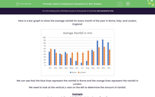
Here is a bar graph to show the average rainfall for every month of the year in Rome, Italy, and London, England:


rainfall bar chart


We can see that the blue lines represent the rainfall in Rome and the orange lines represent the rainfall in London.

We need to look at the vertical y-axis on the left to determine the amount of rainfall.


Example

In January, is the rainfall higher in London or Rome?


Answer

London


We can see that the orange line is higher in London at around 59 mm, whereas the blue line is lower at around 49 mm.


family playing in the rain


Let's get started and have a go at answering some more comparison questions about this bar chart.

What is EdPlace?

We're your National Curriculum aligned online education content provider helping each child succeed in English, maths and science from year 1 to GCSE. With an EdPlace account you’ll be able to track and measure progress, helping each child achieve their best. We build confidence and attainment by personalising each child’s learning at a level that suits them.

Get started
laptop

Try an activity or get started for free

  • National Tutoring Awards 2023 Shortlisted / Parents
    National Tutoring Awards 2023 Shortlisted
  • Private-Tutoring-WINNER-EducationInvestor-Awards / Parents
    Winner - Private Tutoring
  • Bett Awards Finalist / Parents
    Finalist
  • Winner - Best for Home Learning / Parents
    Winner - Best for Home Learning / Parents