


What liquids can you find in your kitchen?
In an experiment, Millie turned bottles of liquids upside down and recorded how long it took for the liquid to fall down.
She constructed a bar chart from her measurements:
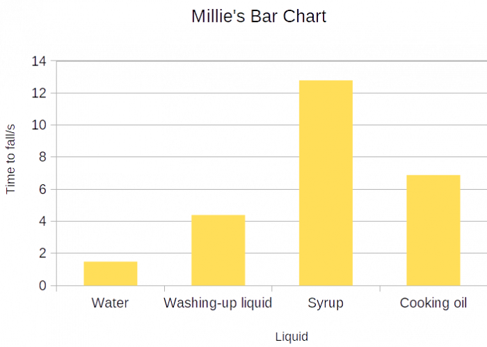
A bar chart is a type of chart where (unsurprisingly!) bars of equal width are used to display the values of different categories.
It is a neat way to represent data because we can see straight away that for example, syrup here, took the longest to fall - it has the highest bar!
Similarly, water took the least amount of time to fall (its bar is the shortest).
We could also read how many seconds each liquid took to fall, though it wouldn't be too accurate from the way this bar chart was drawn.
So we could estimate how many seconds, say, washing-up liquid took.
We can see that the bar for the washing-up liquid is just above 4, so it could be about 4.2 seconds.

Sometimes we use bar charts to compare two (or more) groups within data.
Such bar charts are called dual bar charts.
Let's have a look at an example:
Students at the EdPlace school were asked if they ate a school lunch or a packed lunch on each day of a week:
The results are illustrated in the following bar chart:
.png)
On how many days did the students eat more packed lunches than school lunches?
Well, from the key, we can see that the pink bars correspond to the school lunch while grey represents packed lunches.
We want the days that have a higher number of packed lunches than school lunches.
So we want the days where the grey bar is higher than the pink bar.
So that is two days! Tuesday and Wednesday.
Now, how many more packed lunches were eaten on Tuesday than school lunches?
We can see that the grey bar (packed lunches) on Tuesday reaches 100.
The pink bar (school lunches) on Tuesday reaches only 20.
So on Tuesday, 100 - 20 = 80 more packed lunches were eaten than school lunches.
How many lunches were eaten on Tuesday?
Well, 100 students ate packed lunches and 20 students ate school lunches.
So altogether, that is 100 + 20 = 120 lunches eaten on Tuesday!
Let's put this all into practice!


