


Do you like pies?
Today we'll be looking at how to construct pie charts.
(Though unfortunately we won't be able to eat them!)
A pie chart is a circular chart that is divided into slices (just like a pie!).
It looks like this:
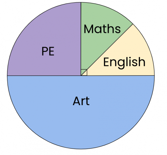
For example, here we can see that each slice represents a subject and art has the biggest slice - that means it was the most common data point!
Let's see how we would construct a pie chart of our own:
Year 7 was surveyed to find out their favourite lunch choices.
The results were organised into a frequency table:
| Lunch Choice | Frequency |
|---|---|
| Pizza | 12 |
| Sandwiches | 8 |
| Pasta | 6 |
| Salad | 4 |
Now how do we make this into a pie chart?!
Well, we know all of the pie chart needs to represent all of the responses.
Altogether, we had 12 + 8 + 6 + 4 = 30 responses.
We can see that we got this by adding all the frequencies together.
We know the full turn angle of a circle is 360°.
That means 360° will need to represent the 30 students.
So we can write:
360° = 30 students
Dividing both of these figures by 30, we find that:
12° = 1 student
That means each student will occupy 12° of the pie chart!
| Lunch Choice | Frequency |
|---|---|
| Pizza | 12 |
| Sandwiches | 8 |
| Pasta | 6 |
| Salad | 4 |
Looking back at the frequency table, we can see that sandwiches for example, has the frequency of 8.
This means that 8 students chose sandwiches.
So, these students' slice in the pie chart will have the angle of 8 x 12° = 96°
(We call this the central angle for the response of sandwiches.)
We just multiplied the frequency with how many degrees correspond to 1 response!
Easy!
We can then find the other central angles in the same way and organise it neatly in the table by adding an extra column:
| Lunch Choice | Frequency | Central Angle |
|---|---|---|
| Pizza | 12 | 12 x 12° = 144° |
| Sandwiches | 8 | 8 x 12° = 96° |
| Pasta | 6 | 6 x 12° ° |
| Salad | 4 | 4 x 12° ° |
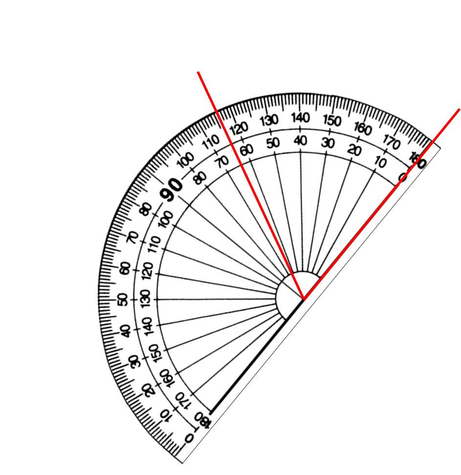
We would then use our protractors to construct all the angles and so the pie chart!
Let's have a go at some questions!


