
How long is your journey to your school?

A survey on the time spent travelling to school by Year 8 students yielded the following results (in minutes):
minimum = 15
lower quartile = 20
median = 35
upper quartile = 45
maximum = 60
Do you remember what all these terms mean?

Minimum and maximum are exactly what they sound like - they are the lowest and highest values in the data set.
Lower quartile (Q1), median (Q2) and upper quartile (Q3) divide the data into quarters:
Lower quartile = 1st quartile (Q1) = 25th percentile, i.e. value that 25% (one quarter) of the data are smaller or equal to - this is the median of the lower half of the data
Median = 2nd quartile (Q2) = 50th percentile, i.e. value that 50% (two quarters) of the data are smaller or equal to
Upper quartile = 3rd quartile (Q3) = 75th percentile, i.e. value that 75% (three quarters) of the data are smaller or equal to - this is the median of the upper half of the data
What kind of chart could we construct from this information?
A type of chart we have not encountered before: a box plot!
.jpg)
Don't worry - they're not that tricky!
A box plot (or box-and-whiskers plot) is basically what it sounds like - a chart that features a box!
Let's have a look at what box plot the travel time data would create to understand it better:
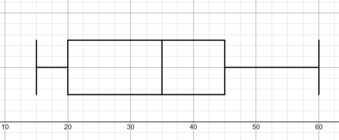
We can see that the chart starts and ends with two vertical lines (the 'whiskers') at the minimum (15) and the maximum (60).
Then there is the 'box' which starts at the lower quartile (20) and ends at the upper quartile (45), i.e. contains the middle 50% of the data.
Finally, it has a vertical line where the median (35) is.
And that's it!
We essentially just draw five vertical lines of the same length at the minimum, lower quartile, median, upper quartile and maximum.
Then we join the three middle lines to create a box and join these with the minimum and maximum values to create the 'whiskers'.
We could also use this to find the interquartile range (IQR), i.e. the distance over which the middle 50% of the data is spread out:
IQR = Q3 - Q1 = 45 - 20 = 25
So the middle 50% of the data is spread out over the distance of 25!
Ready to have a go at some questions?