


Do you like running?
The following frequency table shows the ages of participants in a marathon race:
| Age (years) | Frequency |
|---|---|
| 20 ≤ Age < 25 | 12 |
| 25 ≤ Age < 30 | 18 |
| 30 ≤ Age < 40 | 25 |
| 40 ≤ Age < 55 | 15 |
Create a histogram to represent this data.
Let's remember that histograms are similar to bar charts, only they are for continuous rather than discrete data, so there are no gaps between the bars and on the y-axis we have frequency density.
What is frequency density again?
Frequency density tells us the frequency per unit of what we are measuring - for example per year here!
We calculate the frequency densities by dividing the frequencies by the width of the interval.
But if we look at our frequency table here, we can see that the width of the interval is not the same for each class!

We have the widths:
25 - 20 = 5 for the 20 ≤ Age < 25 class
30 - 25 = 5 for the 25 ≤ Age < 30 class
40 - 30 = 10 for the 30 ≤ Age < 40 class
55 - 40 = 15 for the 40 ≤ Age < 55 class
So we will be dividing the frequencies by different numbers to get our frequency densities:
| Age (years) | Frequency | Frequency density |
|---|---|---|
| 20 ≤ Age < 25 | 12 | 12 ÷ 5 = 2.4 |
| 25 ≤ Age < 30 | 18 | 18 ÷ 5 = 3.6 |
| 30 ≤ Age < 40 | 25 | 25 ÷ 10 = 2.5 |
| 40 ≤ Age < 55 | 15 | 15 ÷ 15 = 1 |
Plotting the ages on the x-axis and frequency density on the y-axis, we then get the following histogram:
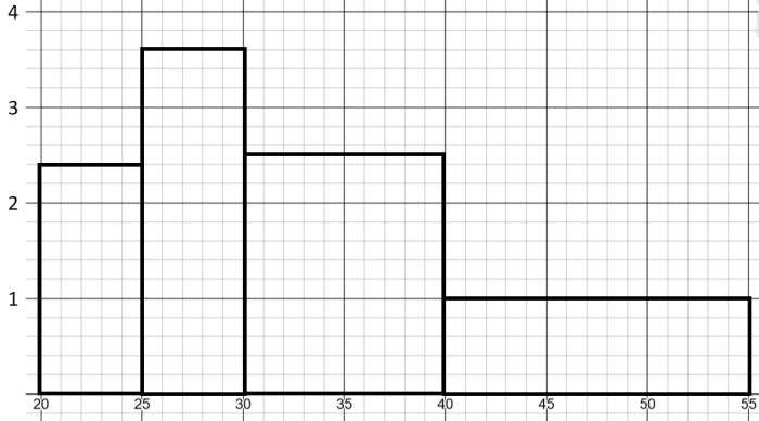
We can see that the bars have different widths!
This is because each class had a different interval width.
And that's actually another difference between histograms and bar charts: the bars in bar charts should always have equal widths!
Let's put this into practice!


