


When do you think you would sell more ice-cream - in the summer or the winter?

A local ice cream van recorded its sales (in £100s) for each quarter of the year for the three years it's been in business, and organised its data into a frequency table:
| Quarter | Sales (in £100) |
|---|---|
| 1 | 12 |
| 2 | 24 |
| 3 | 17 |
| 4 | 5 |
| 5 | 14 |
| 6 | 26 |
| 7 | 20 |
| 8 | 7 |
| 9 | 18 |
| 10 | 28 |
| 11 | 20 |
| 12 | 10 |
Each year has four quarters so e.g. quarter 5 is the first quarter of the second year!
This is an example of time series data, i.e. data points collected or recorded at successive time intervals (like year quarters here!).
By plotting it onto a graph where the time is on the x-axis, we get the time series graph:
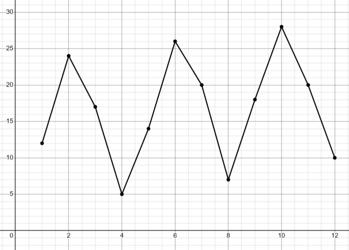
We can use time series graphs to spot patterns and make predictions.
For example, we can see that the sales peaked at quarters 2, 6 and 10, i.e. the second quarters of the years (the summer!).
Then it dips in the last quarter of each year (quarters 4, 8 and 12 which was the winter).
The peaks were between 26 and 28, i.e. £2,600 and £2,800
The peaks increased each time - so the next peak is likely to be around £2,900 in quarter 14 (i.e. the second quarter of the 4th year).

Ready to have a go at some questions?


