


Do you usually have a school or a packed lunch?

Students at the EdPlace school were asked if they ate a school lunch or a packed lunch on each day of a week.
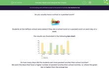
The results are illustrated in the following bar chart:
.png)
On how many days did the students eat more packed lunches than school lunches?
We want the days that have a higher number of packed lunches than school lunches, i.e. where the green bar is higher than the orange bar.
So that is two days! Tuesday and Wednesday.
Now, how many more packed lunches were eaten on Tuesday than school lunches?
We can see that the green bar (packed lunches) on Tuesday reaches 100.
The orange bar (school lunches) on Tuesday reaches only 20.
So on Tuesday, 100 - 20 = 80 more packed lunches were eaten than school lunches.

The above bar chart is an example of a dual bar chart, which is a bar chart where we compare two (or more) groups within data.
If we had a single bar for each day (e.g. just school lunches), we know that this would be a regular bar chart - but we read it the same way!
Let's put this all into practice!


