


In this activity, we're going to interpret information presented to us in a bar graph.
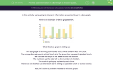
Here is an example of a bar graph/chart.
.png)
What this bar graph is telling us:
The bar graph is showing some data about what children had for lunch.
The orange bar represents school lunch and the green bar represents packed lunch.
We can see the days of the week across the bottom.
The numbers up the side tell us the number of children.
The scale is going up by twenty each time.
There is a key to show us what each bar is telling us (packed lunch or school lunch).
Now, let's solve a problem related to this bar graph.
Example
On which day did the largest number of children have a school lunch?
We can see that the orange bar represents school lunch.
The bar on a Friday is the highest for school lunch.
Answer
Friday was the day when the largest number of children had a school lunch.
Top Tips:
Remember to read the scale on the bar graph carefully.
Putting a piece of paper across the top of a bar can help us to read a total correctly.

Now it's your turn to interpret some data - good luck!


