


In this activity, we're going to be practising reading and comparing information in a selection of bar graphs.
Here is a bar graph showing the favourite subjects of a group of children:
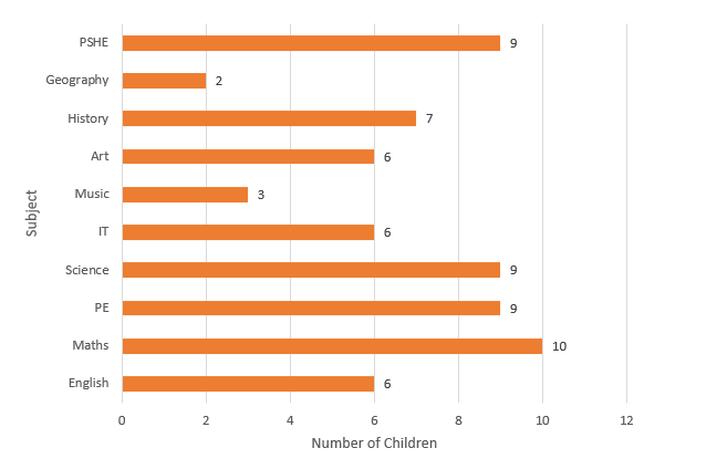
What this graph is telling us:
- The range of subjects
- The number of children who liked each subject best (at the end of each bar)
- We have two labels to tell us what the information is representing (subjects and number of children)
Tip: The total number is not usually included - we need to use the scale to read this information. However, in this graph the total number for each subject has been included.
Let's look at a typical question that we might be asked about this bar graph:
Example
How many more children like maths than English?
Answer
We find the bar for maths and read the total and do the same for English.
Maths = 10 children
English = 6 children
Subtract 6 from 10 to find the answer.
Four more children prefer maths.
Top Tip: Check the scale on graphs - they do not always increase in ones.

Good luck with the following questions.


