In this activity, we're going to be learning how to read and interpret information presented in a line graph.
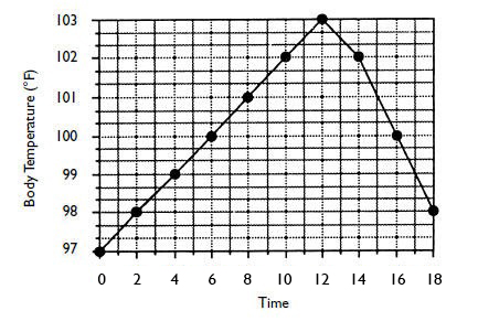
The following line graph shows the temperature of someone over time.
We can see that the horizontal line represents the time (x-axis) and the vertical line represents the temperature in Fahrenheit ºF (y-axis).
The labels on the vertical and horizontal lines are known as legends (they tell us what the information is representing).
The title tells us what the graph is representing.
A line graph showing body temperature over time (minutes)

Let's have a look at a question using this line graph.
Example
What was the person's temperature after 2 minutes?
The x-axis starts at 0 - this is representing time in this graph.
In this graph, the y-axis starts at 97ºF
First, we travel along the x-axis to 2 minutes and then read up to the graph line (there is a black dot here).
From here, we draw a line across from the 2 minute dot to find the temperature, which is 98ºF
Answer
The temperature after 2 minutes is 98ºF
Top Tips:
Read the questions carefully.
Look at the scale on each graph carefully.
Note that this graph shows temperatures in Fahrenheit ºF rather than the more commonly used Celsius ºC
Interestingly, normal body temperature in Fahrenheit is about 98º, so the person whose temperature is being recorded above must be feeling pretty poorly!

Let's try some questions now.


