

In this activity, we're going to be learning how to read and interpret information presented in a line graph.
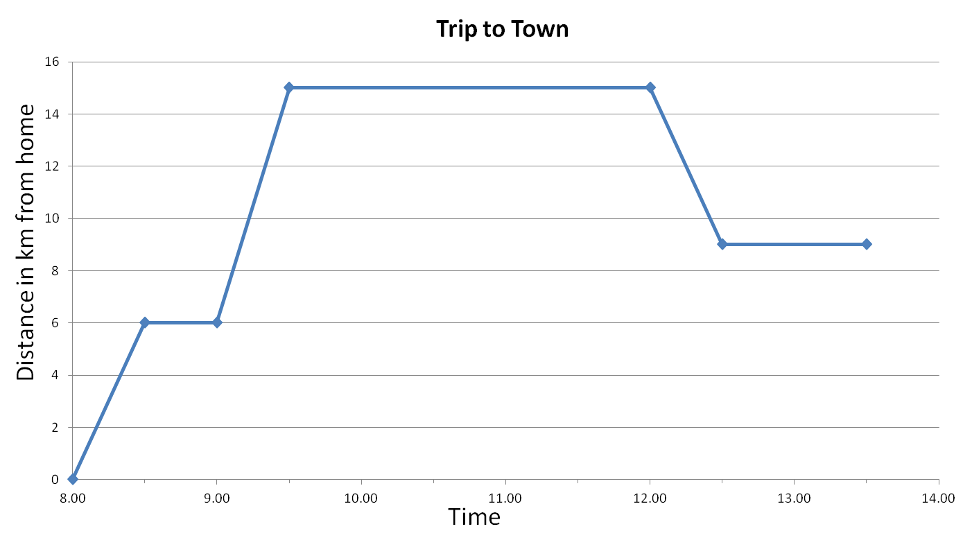
The following line graph shows how far someone travelled from home to town, and how long it took.
We can see that the horizontal line represents the time (x-axis) and the vertical line represents the distance in km from home (y-axis).
The labels on the vertical and horizontal lines are known as legends (they tell us what the information is representing).
The title tells us what the graph is representing.
Let's have a look at a question using this line graph:
Example
How long did it take to travel 6 km from home?
The y-axis starts at 0 - this is home in this graph
In this graph, the x-axis starts at 8:00
First, we travel up the y-axis to 6 km and then read across to find where the blue line reaches 6 km.
From here, we draw a line down from the 6 km dot to find the time, which is 8:30 am
Answer
It took 30 minutes to travel 6 km from home (8:00 to 8:30 = 30 minutes)
Top Tips:
Read the questions carefully.
Look at the scale on each graph carefully.

Good luck with the following questions.


