In this activity, we're going to compare information presented to us in pie charts.
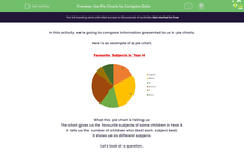
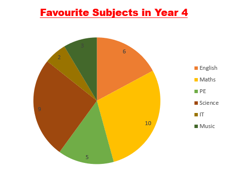
Here is an example of a pie chart.
What this pie chart is telling us:
The chart gives us the favourite subjects of some children in Year 4.
It tells us the number of children who liked each subject best.
It shows us six different subjects.
Let's look at a question.
Example
How many more children liked maths than English?
Answer
Using the key, find the segment of the pie that represents each subject.
Sometimes the colours are a bit tricky to distinguish, so remember that the order of the segments is the same as the order of the subjects in the key!
Maths = 10
English = 6
Subtract 6 from 10 to find the answer
10 - 6 = 4
4 more children prefer maths.

Now it's your turn to answer some questions.


