We know that data can be presented in lots of different formats.
In this activity, we'll be reading and comparing data in different types of graph.
Let's have a look at an example:
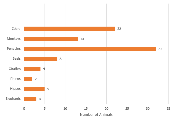
Number of animals at Valley Safari Park
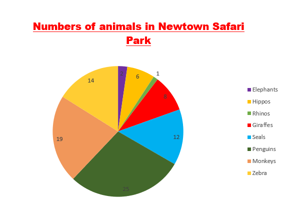
Here we have a pie chart and a bar graph.
Both graphs are giving us information about the number of animals each safari park has.
The information is just presented in different formats.
Let's have a look at a question.
Example
How many more giraffes does Newtown have than Valley Safari park?
Use the key on Newtown to find the correct segment and the number of giraffes (8)
Read the bar for giraffes on the Valley graph (4)
We need to find the difference.
8 - 4 = 4
Answer
Newtown has four more giraffes than Valley Safari Park.

Now it's your turn.


