


Do you like drawing pictures?

Could we use pictures to represent data?
Yes, we can!
In the form of pictograms.
A pictogram is a type of chart that uses pictures or symbols to represent numerical data.

Let's have a look at an example:
Alice recorded how many chocolate bars she sold in her charity fundraising efforts each day.
She constructed a pictogram to represent the data:
.png)
We can see the pictogram includes a key:

This is something all pictograms will have!
In this pictogram, it tells us how many chocolate bars, each bar drawn represents.
The key in this pictogram tells us that one bar in the pictogram represents 8 chocolate bars in real life.
This means that for example, on Tuesday, Alice sold:
8 + 8 + 6 = 22 chocolate bars.
That's because:

is the same as

Each of the full bars is 8:
So:
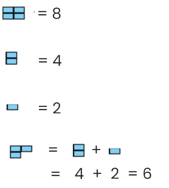
Hence we get 8 + 8 + 6 = 22 chocolate bars!

Why do you think Alice chose a pictogram to represent her data rather than a different type of chart?
Well, perhaps she wanted to see which days she sold the most and least chocolate on.
That way she can see which days to concentrate on in her fundraising efforts or which places to visit again if she was changing locations!
From this pictogram, we can see straight away that Alice sold the most chocolate on Tuesday and the least on Wednesday (she sold none then!).
Let's have a go at some questions!


