A distance-time graph is a type of graph that can be used to provide information about a specific journey. It normally looks a bit like a line graph.
In a distance-time graph, the distance is always shown on the y-axis. The time is shown on the x-axis.
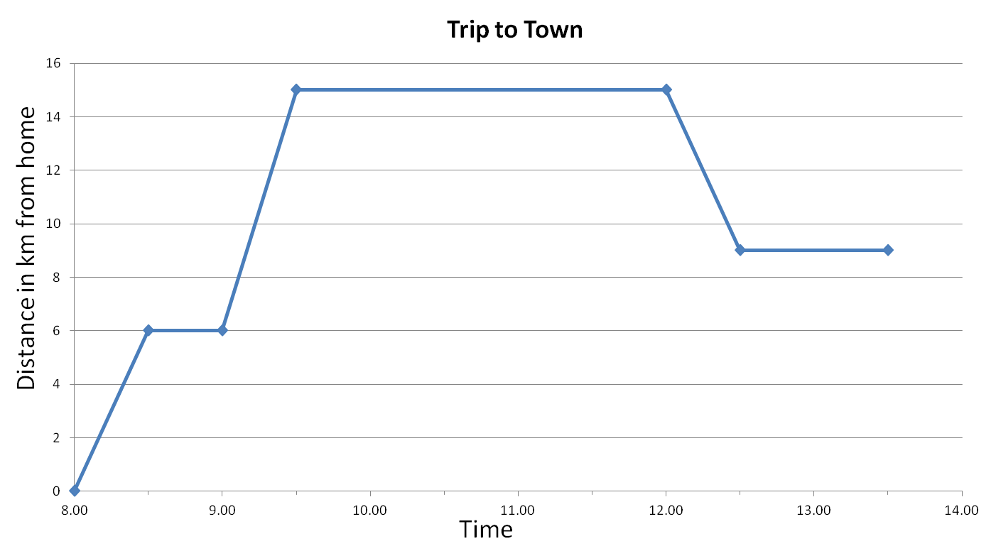
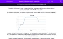
This is an example of a distance-time graph. As mentioned, you can see that distance in kilometres is on the y-axis. A distance-time graph could use all sorts of different units on the y-axis, as long as they were all a measure of distance.
On the x-axis is the time of day. Sometimes the x-axis shows time in seconds, or minutes, instead.
This graph could be divided into six sections. For example, in the first section, we can see that between 8:00 and 8:30, the distance went from 0 km to 6 km from home.
Let's make sure we understand what the different lines on the graph mean.
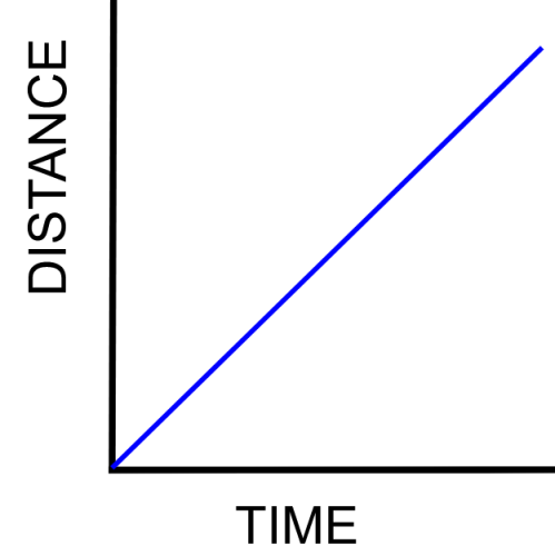
Here is a simple example showing a positive, diagonal line on a distance-time graph.
In this graph, the line tells us that the distance of the object is increasing, as time increases. In other words, the object is moving away at a constant speed.
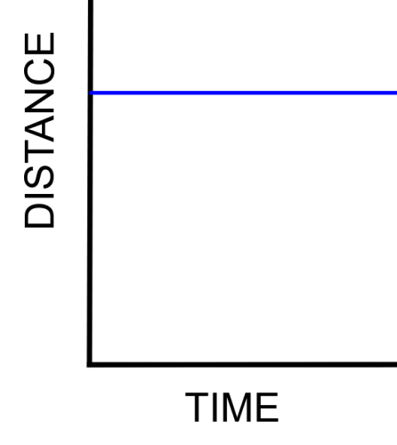
What about this example? What does this shape represent?
In this graph, as time progresses, the distance is not changing. That means that the object is not moving - it is stationary.
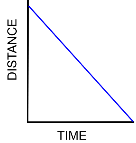
Here is another example. What does this type of line on a distance-time graph show?
In this example, you might recognise that the straight diagonal line means that the object is moving at a constant speed. That is correct - but what about the direction of the line?
As time goes on, the object's distance from zero is reducing. This means the object is moving towards zero! In other words, you could say that this negative slope means that the object is moving backwards.
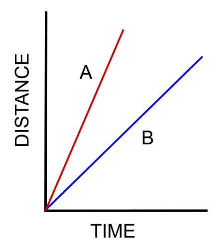
Here is one more example. There are two objects this time, represented on the graph as A and B.
Which object do you think is moving faster?
In this graph, object A is moving faster than object B. Object A travels a greater distance than object B, in less time, so it must be faster.
You can also see that the line for object A is steeper than the line for object B. The steeper the line, the faster the object.
Finally, let's go back to our earlier example of a distance-time graph.

Now that you understand what the lines mean, you can visualise this journey, of a Trip to Town. The person started their journey at 8:00, travelling 6 km. They stopped for 30 minutes and didn't move. Between 9:00 and 9:30 they travelled 9 km. This was at a faster speed than the first leg of their journey because the line is steeper.
From 9:30 - 12:00, this person was not travelling. Between 12:00 and 12:30 they travelled 5 km back, towards their home. They then stopped again between 12:30 and 13:30.
Now that you have practised interpreting these graphs, let's try some practice questions!

