


In this activity, we are going to compare some information in a bar graph to answer some questions.
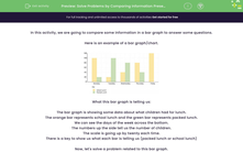
Here is an example of a bar graph/chart.
.png)
What this bar graph is telling us:
The bar graph is showing some data about what children had for lunch.
The orange bar represents school lunch and the green bar represents packed lunch.
We can see the days of the week across the bottom.
The numbers up the side tell us the number of children.
The scale is going up by twenty each time.
There is a key to show us what each bar is telling us (packed lunch or school lunch)
Now, let's solve a problem related to this bar graph.
Example
How many more children had a school lunch than a packed lunch on Monday?
Answer
We can see that 100 (orange bar) children had a school lunch on Monday.
We can see that 20 (green bar) children had a packed lunch on Monday.
We need to subtract 20 from 100 to find out how many more had a school lunch.
100 - 20 = 80
80 more children had a school lunch on Monday.

Top Tip: Remember to read the scale on the bar graph carefully.
Now it's your turn - good luck!


